
Market price
In this introductory lesson on economic principles, we'll explore how an equilibrium price is formed. We'll use the wine market as an example, with consumers representing demand and producers representing supply.
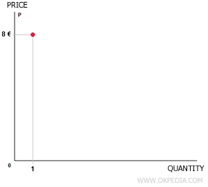
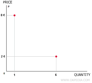
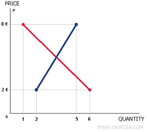
Let’s start by drawing a graph, with price on the vertical axis and the quantity of wine on the horizontal axis. Suppose the price of wine is quite high—let’s say 8 euros per liter. At this price, our ideal consumer would only purchase one liter per month. We can illustrate this by plotting a point on the graph.
Now, let’s assume the price of wine drops to 2 euros per liter. Our consumer would be willing to buy 6 liters of wine. We can plot this second point on the graph as well.
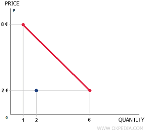
By connecting these two points, we can visualize the consumer’s demand curve. In this example, the curve is shown in red.

However, demand alone doesn't reveal the market price of wine. To figure this out, we also need to consider the producer's behavior—specifically, how much they’re willing to supply at different price points.
Let’s assume that at a price of 2 euros per liter, the producer is only willing to supply 2 liters of wine. This can be plotted as another point on the graph.
Now imagine the price of wine rises to 8 euros per liter. At this higher price, the producer would be willing to supply 5 liters, as it becomes more profitable, and new competitors may enter the market. This gives us a second point to plot.
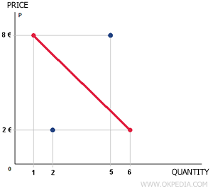
By connecting these two points, we can create a graphical representation of the supply curve, which is shown in blue in this example.
The point where the demand curve intersects with the supply curve represents the market equilibrium price. In this example, the equilibrium price is 4 euros. At this price, the consumer is willing to buy 3.5 liters of wine, and the producer is willing to supply the same amount.
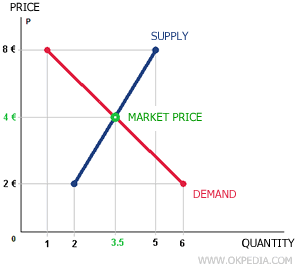
This is how we can determine the market equilibrium price graphically.


